Re-designing the Time Machine in Back to the Future
I grew up watching Back to the Future trilogy (especially with those reruns on TV). But every time I saw the scenes where Dr. Brown or Marty operated the time machine’s dashboard, I was always like: “Is that really a good way to enter your time travel information? I mean, this is time traveling we are talking about. Don’t you guys have a quicker, safer, and slicker way to enter the times?” I was a young boy, not even knowing what Human Computer Interaction meant (or any of what the 3 words meant, :D), but the bad design of the dashboard did catch my attention. Granted, plot thickened and the story got more interesting when the characters got into trouble with the wrong time entries. But I just thought the Delorean deserves a better gadget, plus, it’s a good design activity.
Original Design
So the original dashboard looks like these:
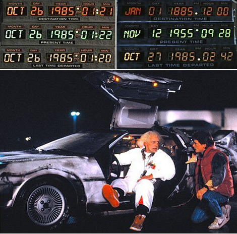
(image source: link)
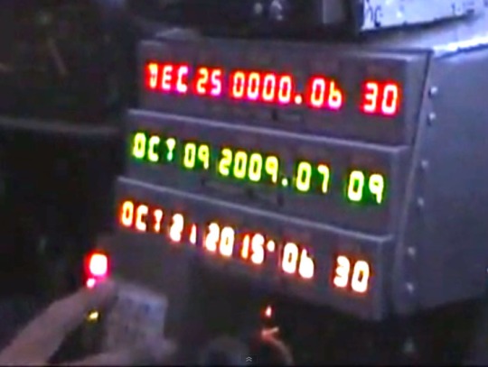
(image source: snapshot from this video)
The driver uses the number keypad to enter the destination time. But when you drive in a fast and small space, it’s not uncommon you enter a wrong number. Also, the relationships between destination time, present time, and time of departure are not visually clear. Plus, the whole dashboard is just taking too much space (but it’s definitely good to cram the space with a bunch of electronics to show what a grass-root scientist Doc is. :D). So, here are the 2 new versions I propose.
My Design
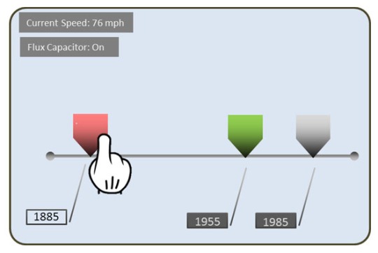
New Design A (Sized version)

My idea is based on dragging a slider on a touch screen. Here are some of my design considerations.
- 3 slider heads are placed on a timeline.
- Since we are doing time travel, where you are from/to isn’t always past/future, so these heads need to have a new visual representation. According to the movie, the present time was positioned in the middle of the dashboard, which is supposed to mean the most important information. So in my design, using that importance level, I use the big head as the present time, the small head as the time of when you are from, and a middle one as the destination time.
- The destination time head is tappable and draggable. Dragging that head can modify the destination time.
- The present time and “from time” are not draggable (obviously that’s something you can’t change). But they are tappable to show detailed info.
- The destination time head glows with animation to hint the driver that it’s some info s/he can change.
- The 2 ends of the timeline are tappable. When tapped, the timeline extends (to one of the directions) to show more time available.
New Design B (Colored version)
This design is pretty much like New Design A, except the head sizes are the same. They are colored in gray (for “from time”, a less important info), green (for present time, color chosen from the original design in the movie), and red (for “to-time”, color chosen from the original design, which specifies the idea of “this needs more attention”).
Conclusion
The main idea of my new design is incorporating a touchscreen and a slider timeline to allow visual presentation and gestural input. As mentioned, since it’s time travel, the past isn’t always when you are from and what’s in the future isn’t always when you are going, so I use different sizes or colors to specify when you actually are/from/to on the timeline.
Suggestions? Comments? Really to go 88 miles per hour? 🙂
( the finger image in my design is from: http://openclipart.org/detail/160447/)


Recent Comments